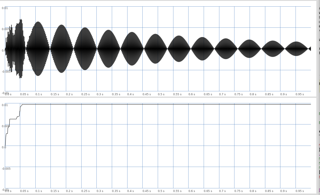
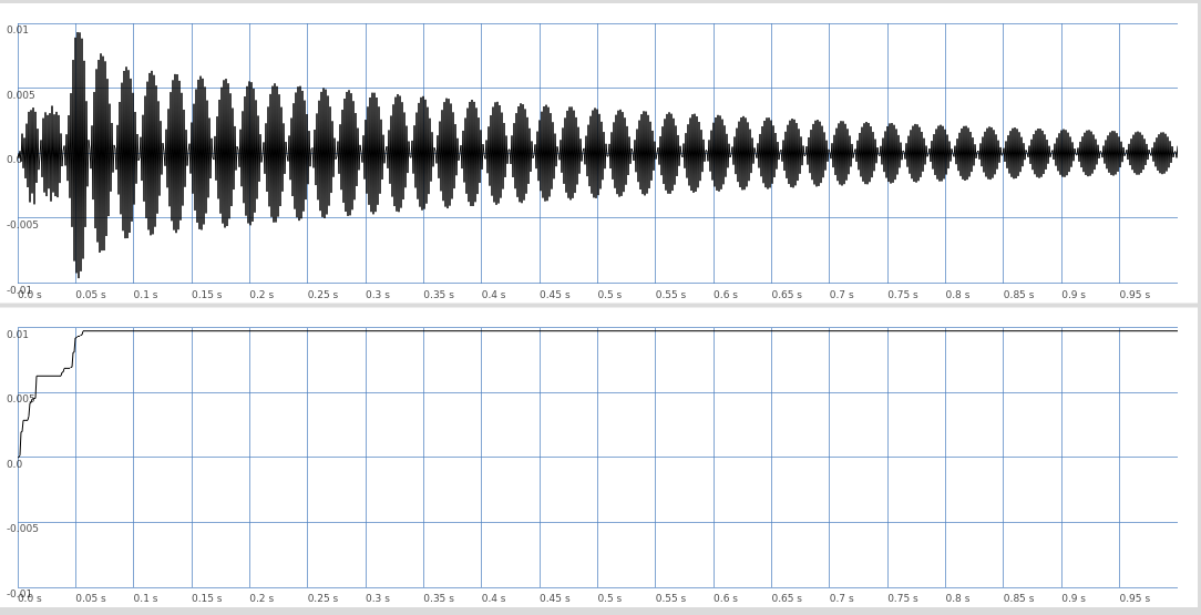
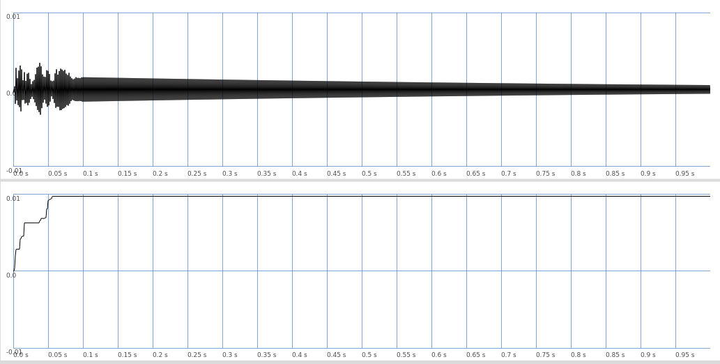
A curious effect…
Code below to generate plot:
(
{
	var sig, ma, rez, env;
	sig = LFNoise0.ar(5000);
	env = EnvGen.kr(Env([0,1,0],[0.001,0.1]));
	rez = Resonz.ar(sig * env, 500,0.001);
	ma = RunningMax.ar(rez);
	[rez,ma]
}.plot(1)
)
I’m resizing the plot window just slightly, and as I resize it looks significantly different. Both in terms of the um, blobs, but also the height of the initial transient, which goes up almost to 0.01 as seen in the bottom half of the plot, but this is only sometimes visible in the top plot (this was a little concerning to me as I was trying to eyeball some amplitudes…)
The pics below are just a few examples, there are also noisier patterns and moire patterns that show up, but I don’t want to upload too many pics. I suppose most people have seen this before, but I just noticed how wierd it is and I’m wondering what the effect is, with respect to the data and the algorithm that generates the plot. Something to do with finding the mean height of a block or something?