Hi,
I’d like to quickly disable a couple of buttons and text views and also indicate that visually. I’ve found View.enabled but how does one do the greying out when buttons have different states sizes and text views don’t have states at all?
Hi,
I’d like to quickly disable a couple of buttons and text views and also indicate that visually. I’ve found View.enabled but how does one do the greying out when buttons have different states sizes and text views don’t have states at all?
The states and sizes make absolutely no difference to the enabled status. (Why would they?)
So the answer is that you just call enabled on the views that need to be affected.
hjh
So the answer is that you just call
enabledon the views that need to be affected.
The problem is that this does not make my buttons grey. They look just the same as before only they are disabled. .background_() doesn’t work and if I add a greyed out state the button will eventually become grey just by clicking on it which is not desired here. I want a button that is grey when disabled and green when not.
Ah OK… I misunderstood the question. I had seen other types of views grey out, but I hadn’t tried it with buttons.
Indeed, they don’t go gray when enabled_(false).
That sounds like a bug to me, actually – feel free to log an issue at Issues · supercollider/supercollider · GitHub .
In the meantime, I would use SCViewHolder to extend Button’s behavior – save this into your Extensions directory:
ButtonWithEnable : SCViewHolder {
	var <states, <enabled = true;

	*new { |parent, bounds|
		^super.new.init(parent, bounds)
	}

	init { |parent, bounds|
		view = Button(parent, bounds);
	}

	states_ { |argStates|
		states = argStates;
		view.states = this.activeOrInactiveStates;
	}

	enabled_ { |bool|
		enabled = bool;
		view.enabled = bool;
		view.states = this.activeOrInactiveStates;
	}

	activeOrInactiveStates {
		if(enabled) { ^states };
		^states.collect { |row|
			[row[0], this.dimColor(row[1]), this.dimColor(row[2])]
		};
	}

	dimColor { |color|
		if(color.respondsTo(\asHSV)) {
			color = color.asHSV;
			color[1] = color[1] * 0.1;  // desaturate
			color[2] = color[2] * 0.5;  // darken
			color = Color.hsv(*color);
		};
		^color
	}
}
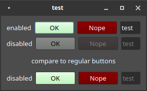
Demo:
(
var states = [
	["OK", Color.black, Color(0.8, 1, 0.8)],
	["Nope", Color.white, Color(0.5, 0, 0)]
];

w = Window("test", Rect(800, 200, 200, 150)).front;
w.layout = VLayout(
	HLayout(
		nil,
		StaticText().align_(\center).string_("enabled"),
		ButtonWithEnable().states_(states).enabled_(true),
		ButtonWithEnable().states_(states).enabled_(true).value_(1),
		TextField().string_("test").enabled_(true),
		nil
	),
	HLayout(
		nil,
		StaticText().align_(\center).string_("disabled"),
		ButtonWithEnable().states_(states).enabled_(false),
		ButtonWithEnable().states_(states).enabled_(false).value_(1),
		TextField().string_("test").enabled_(false),
		nil
	),
	StaticText().align_(\center).string_("compare to regular views"),
	HLayout(
		nil,
		StaticText().align_(\center).string_("disabled"),
		Button().states_(states).enabled_(false),
		Button().states_(states).enabled_(false).value_(1),
		TextField().string_("test").enabled_(false),
		nil
	)
);
)
SCViewHolder is often overlooked but IMO in many cases, it’s the best way to alter a view’s behavior. In this case, my reasoning is – There could be two sets of states: the states given by the user, and the states to be displayed. ButtonWithEnable always holds the user’s states, while updating the physical Button’s display. The rest of your code interacts with the holder (“Adapter” in Design Pattern terms) as if it were the button.
hjh
I was overlooking it because I didn’t know it existed. Thanks for this.
Sam
Nice! Thank you, James! SCViewHolder looks like a piece of the SC gui puzzle I have been looking for.
(Although buttons should have this behavior built in, I think.)