If anyone is interested (someone at the last dev meeting was, I forget who), this is the branch where I was stowing IDE style changes a few years ago.
IIRC I broke them into readily cherry-pickable commits, apart from some of the stylesheet things which are a little more complex. Everything in that branch bar 3 or 4 changes should be straightforward and uncontroversial improvements.
I don’t think styling via style sheet is a very good option. Using palettes in QT is fairly straightforward - they cascade through UI view hierarchies, and there are only 16 or so values. Custom drawing can simply be written in C++ code - not the most accessible, but relatively straightforward. As I remember it, stylesheets are:
- more powerful, and somewhat easier to edit
- much more fiddly
- require C++ work to make sure EVERY ui component will pick up stylesheet colors, else you get awkward outliers (see changes with “allow styling”)
- not parameterizable - this means, you end up with a bunch of hard-coded magic number values in your stylesheet, that represent e.g. “the background color of this thing, but with brightness dropped by 0.1”. Editing this 4 years down the road would be a NIGHTMARE.
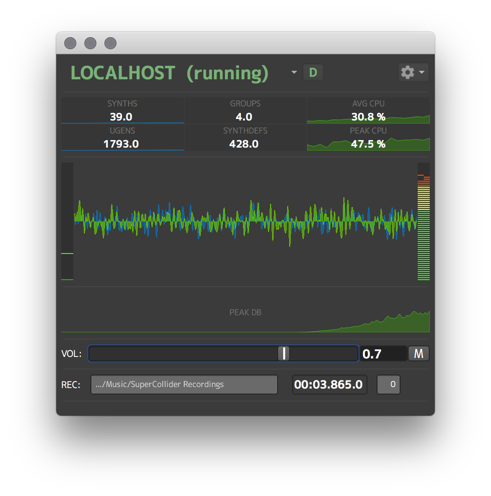
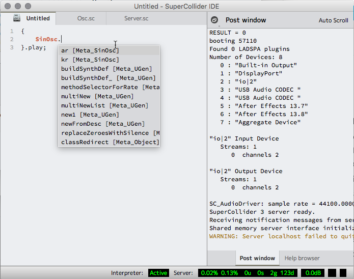
The branch also adds Source Code Pro as a default editor font, and M+ as the default gui font. I felt (and still feel) that the general look and character of the app are greatly improved with some consistency across platforms - fonts most of all. Most OS’s don’t have good code fonts installed by default - on some platforms, the options are downright awful.
- I chose Source Code Pro as the code font because it’s open source, well maintained, and has a wide variety of weights to allow for e.g. slight bolding of class named etc. And, it looks very good. I also really like Haslig, which is Source Code Pro but with combined ligatures for common operators. This looks really nice for operator-heavy code.
- I chose M+ as a default font for sclang GUIs because it has an open license, is well maintained, has good multilingual support, and has a wide variety of weights and widths (including fixed width) that make it very good for UI work (it’s super awesome to have a fixed width version of your font to show numbers, but a proportional variant for everything else). And, it looks very good.
I won’t have much time to work on this in the next month or so, but if anyone wants to update the branch and peel off the uncontroversial changes (everything but stylesheets and fonts), I think it would be a super worthwhile place to start IDE improvements.
