Sorry if this is very basic question.
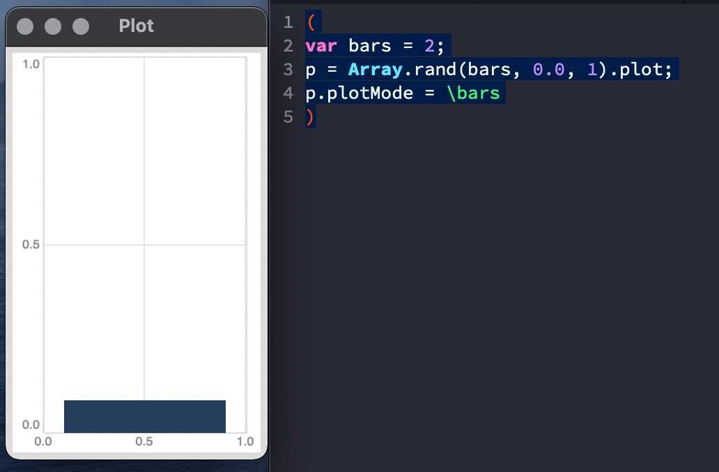
I am experiencing this using plot, let’s say I create an array with 2 elements, then I set plot mode to \bars, however it only shows a single bar. As a total beginner with SC , I just wondering if that is expected, if so, how can we make it to show a bar per array element?
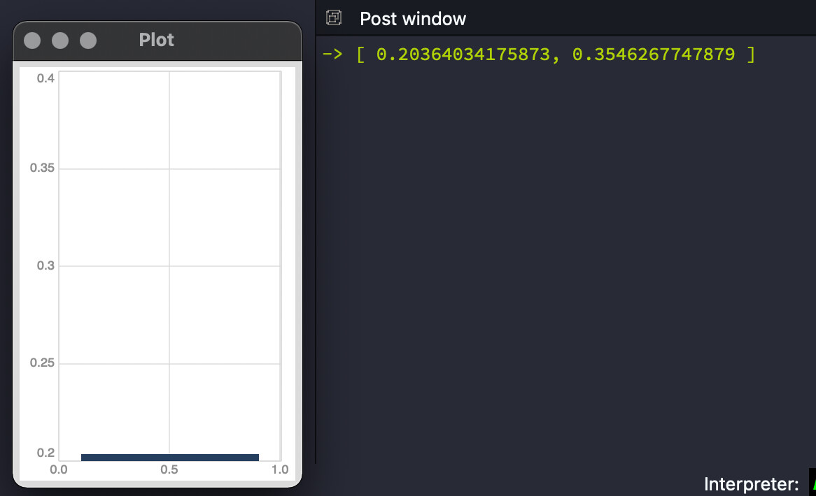
that was my initial impression too by checking p.values in the post window, the array has the correct elements, just the last one is skipped in the graph:
AFAIK it is always the last value that is left out in bars mode which kinda make sense. When in point or linear mode, the first value is displayed on the leftmost vertical line, last value on the rightmost vertical line. Bars and steps fill out the space between vertical lines and show from when the value was changed until next value change. There is no way they can show the value that starts on the rightmost vertical line without adding another vertical line to the plot. I guess from a design point of view it makes sense not to alter the size of the plot when flipping through modes which you would have to do to show the last value.
Thanks for the info @Thor_Madsen, very appreciated.
What I’ve found a bit confusing is (as SC beginner) is, if I have an array with 8 elements and I enable the “edit mode” on, I was expecting that allow me to edit all the values (8), that seems true with some modes, except \bars and \step if I recall correctly?
I still find this a bit confusing why if you have n elements in your array, plot them, then use the “m” shortcut to rotate between modes, it doesn’t keep the “visual” consistency, I would expect it “auto-fit” to n elements? but I am missing something probably.
Actually I am not relying on editing too much, just random values. However I’ve found editmode useful to fine tune some random sequences if want to repeat/modify some result. Definitely I will check too multislider.
@VIRTUALDOG - I wonder if it really is a bug or rather a design decision to keep the dimensions of the plot the same regardless of plotmode (see my comment above)?
The x axis must be divided into either n-1 or n points. n-1 makes more sense for line mode; n makes more sense for bars.
This poses a problem for the domain labels across the bottom.
If the domain labels divide according to n-1, then they look right – the given lower bound is fully at the left margin, and the given upper bound is at the right margin. Then the horizontal region for the last element sits beyond the right margin. This is fine if a data point doesn’t occupy any horizontal space (line mode). It’s not fine if the data point does require horizontal space (bars).
If the domain labels divide by n, then the given upper bound will be inset by 1/n of the plot width, inward from the right margin. You can be sure users will complain about that. OK, so then we might want to see a label at the far right margin – extrapolate a number. Then people will ask, “Why is the rightmost domain label larger than the upper bound I specified?”
Then, a line-mode plot would stop short of the right margin – more complaints. You could offset the points into the middle of their horizontal regions, but then they wouldn’t align with the correct domain values.
So you could adapt – change the labels according to the mode. But modes can be set independently per channel. What should it do if you superpose multiple plots, with different modes that require different divisions?
Perhaps an acceptable compromise would be to align the domain values into the middle of the n divisions, instead of at the left of each division as they are currently. The plot of a small array would then have wider margins (minor complaints perhaps, but there would be a clear and consistent explanation for the behavior, unlike the current situation where attempts at explanation lead to inconsistencies), but there would be space to accommodate bars as well.
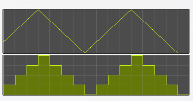
As you can see there are two modes, lines (with interpolation) and bars, both representing the same data with same array size [16]. That is what I meant with keeping consistency across modes, it always show you “all the values” in there, even if the visualization mode is different.
Yes, that should be the baseline expectation for a plotting tool. Not sure why there’s been so much difficulty agreeing on that! There are lots of other plotting libraries out there to get ideas from, as you mentioned. I think the full width horizontal bars like in your screenshot make the most sense as a default for the datasets typical to SC.
If the domain values 0, 1, 2 … 15 are placed under the control points in the line view, or step points in the bars view, then you would have either: a/ an empty space in the domain row at the right margin, where a user might expect to see numbers all the way across, or 2/ a spurious 16 at the right margin, displayed but not corresponding to an existing data point. I’d say neither is particularly comforting.
A related issue is that the line view has an extraneous flat segment at the end, which doesn’t represent actual data. I’d just as soon not have that.
That’s why I suggested:
Keep the bars view as shown in that image.
Position the line-view control points in the middle of each bar.
Position the domain values also in the middle of each horizontal division (centered with the control points).
The line view would be offset by half a bar, and stop half a bar before the right margin, but would have exactly the right number of points, no extra segments, and would switch seamlessly to other view modes.
I completely agree that the current behavior isn’t ideal. I’d have to be convinced about left-justifying the data points though.
Yes. I think how data is distributed in the x axis is the key, it can be centered or left -aligned , that is a bit more a Ui design preference I guess? As long as it show all the values parsed to the plot.
What I was pointing out is also related to edit mode (e shortcut), which right now doesn’t seems to work (by default) properly if you use \bars, how user can edit the last value? (if desired). Adding a dummy element does the trick “visually” but this also increases the plot value array to size + 1 , what imho add extra code to truncate the array back to the correct size.
In any case , I have switched to plines mode meanwhile, which works fine for my purpose.